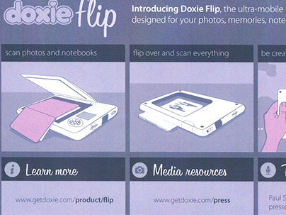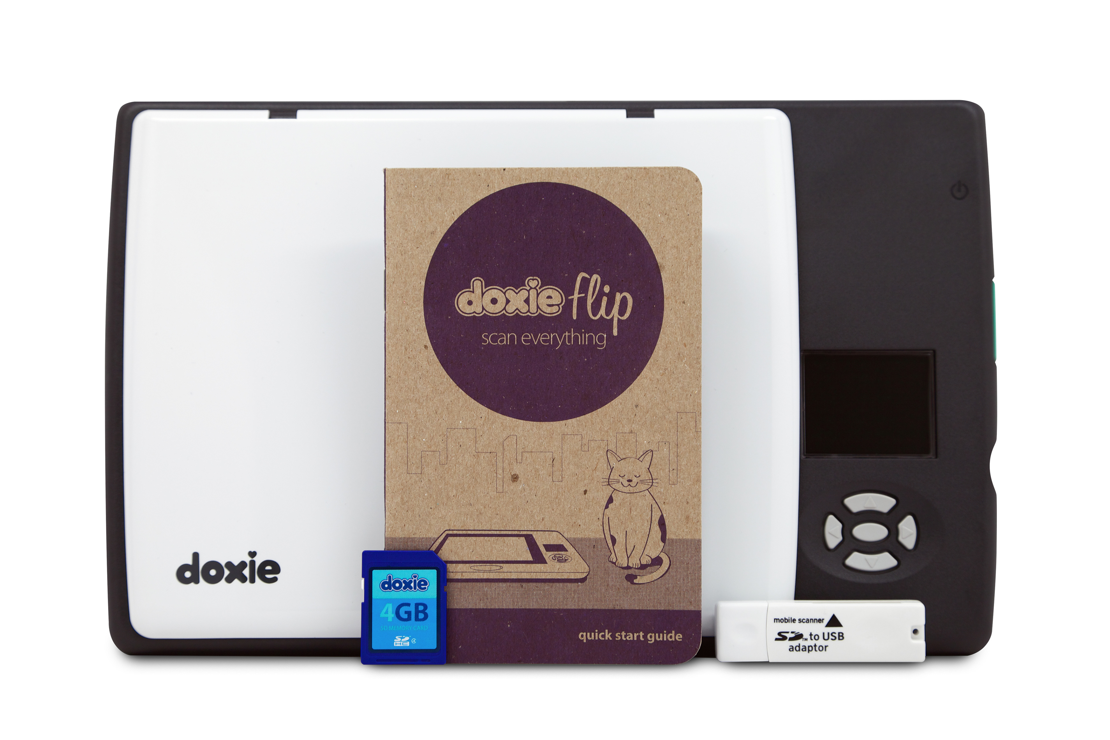
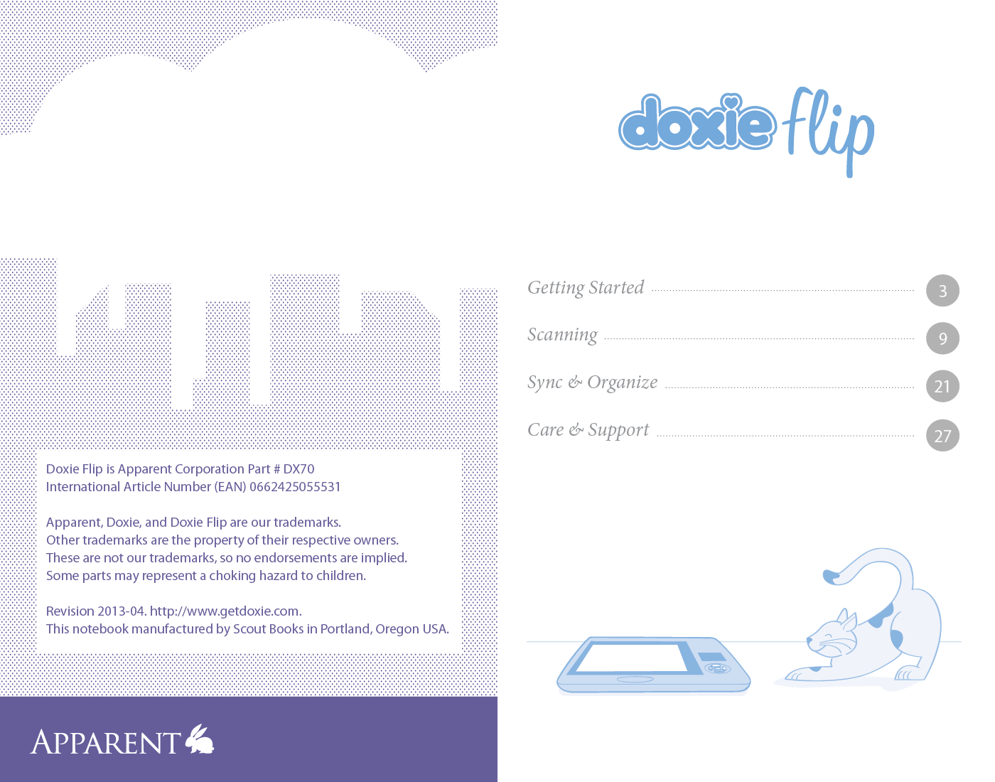
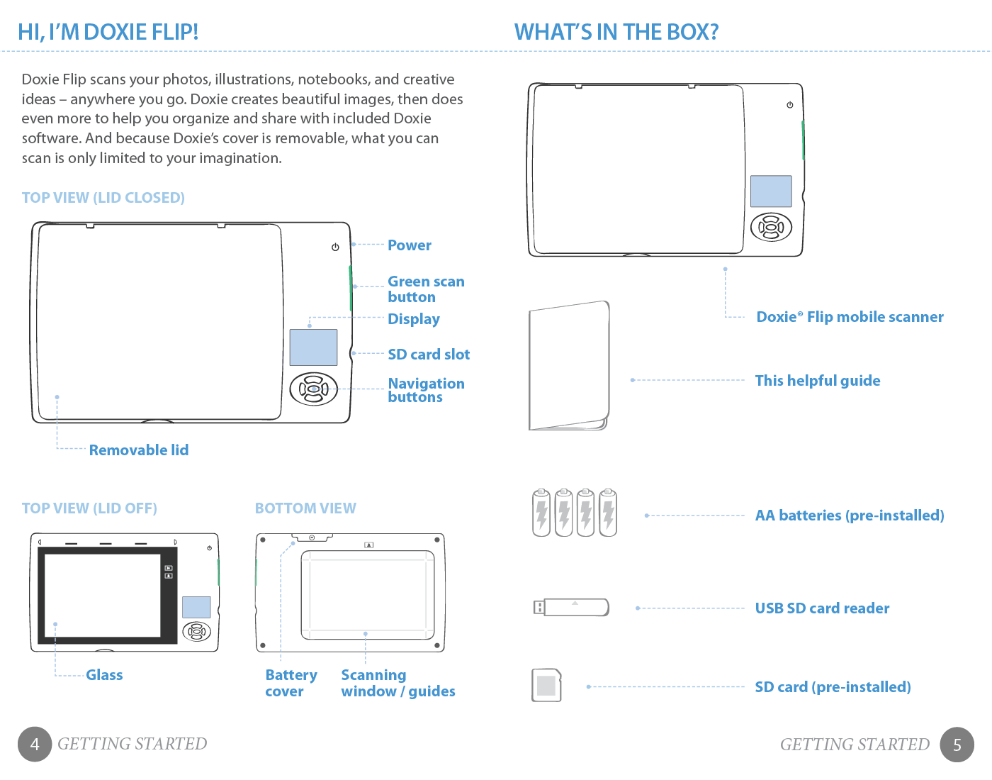
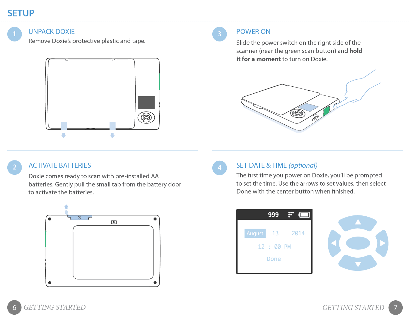
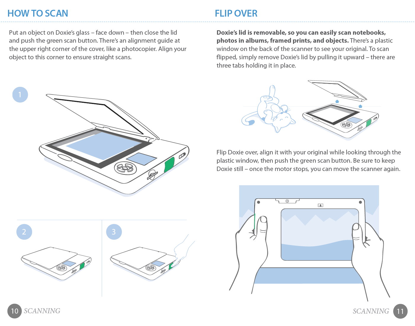
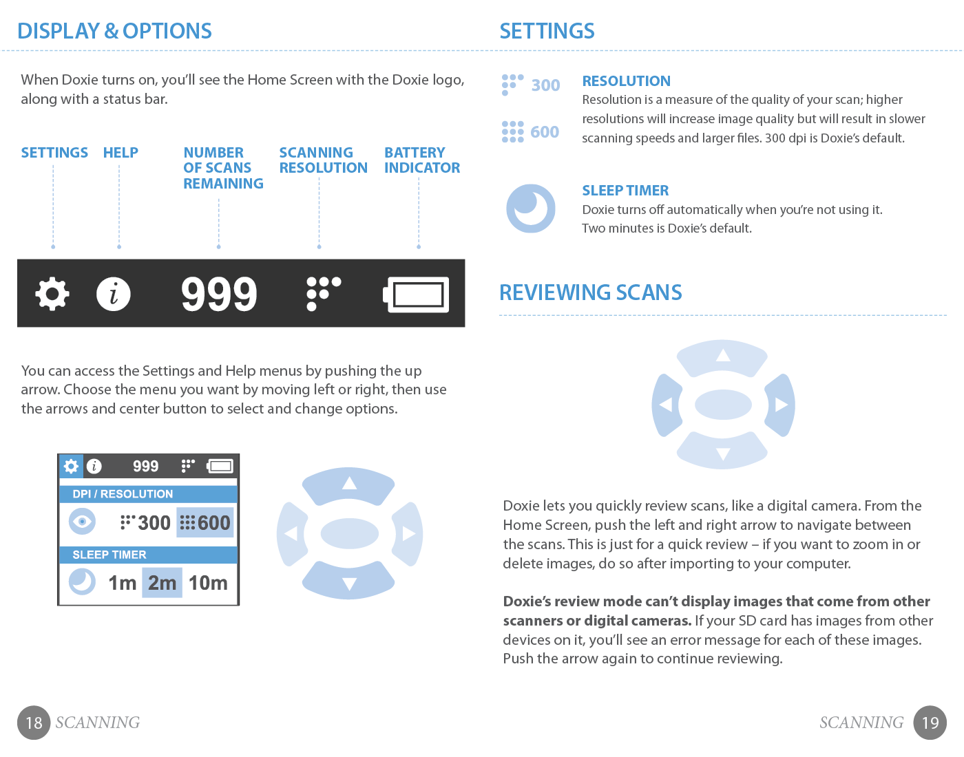
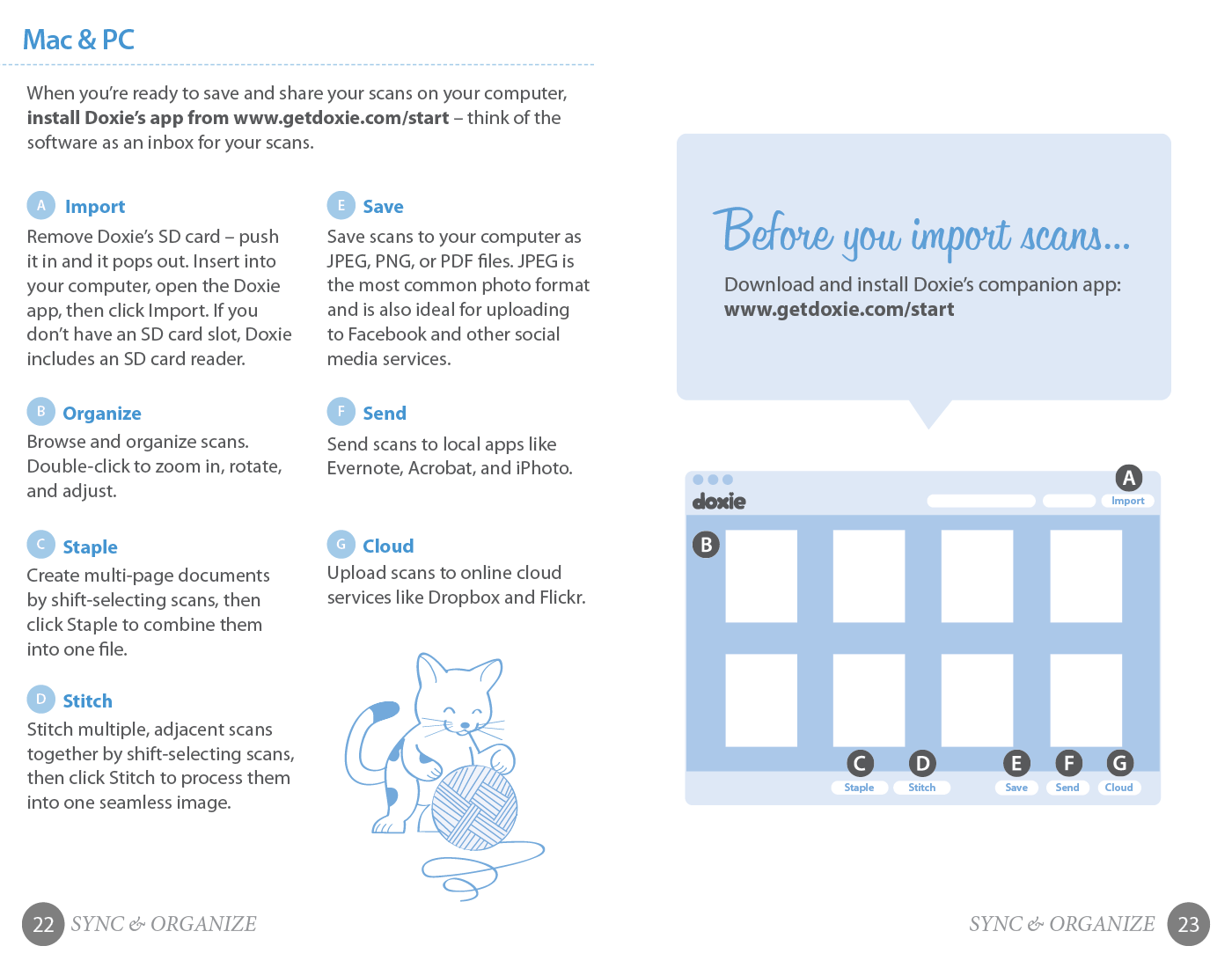
With the launch of the Doxie Flip in 2013, like all of the other products in the Doxie line, it had to come with a really cool quick start guide. It was printed by Scout Books in Oregon, and was meant to resemble a small pocket notebook like Scout notebooks or Field Guides notebooks. It was done with a limited color palette to give it a retro feel. All layout, illustrations and technical illustrations done by myself. I also designed the layout for the Doxie Flip's LCD screen as well as creating all of the icons.
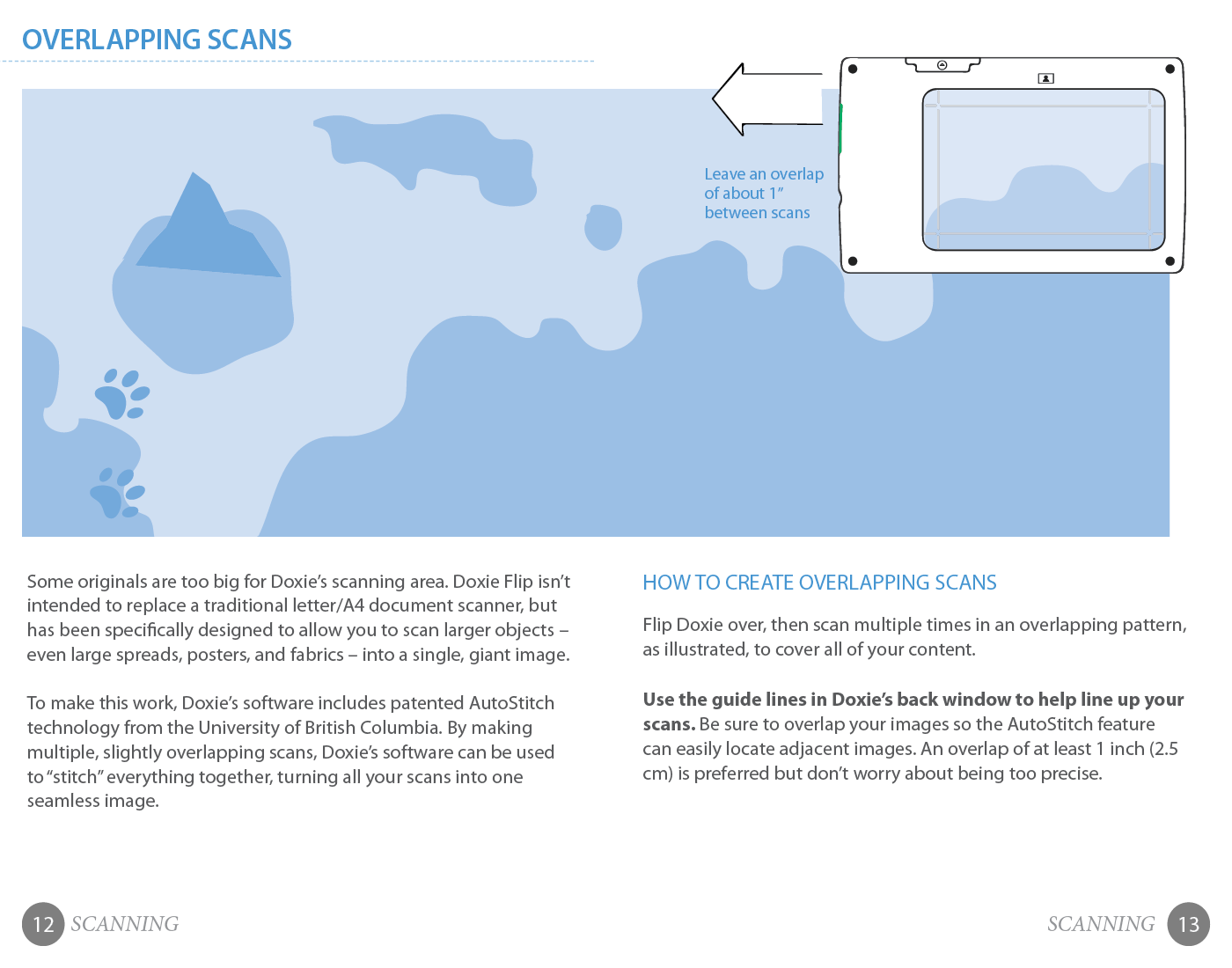
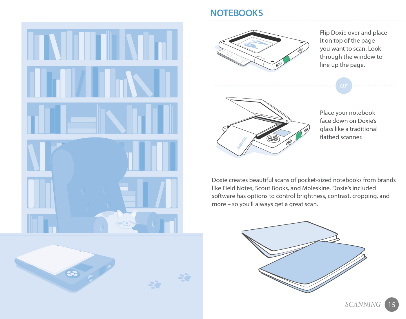
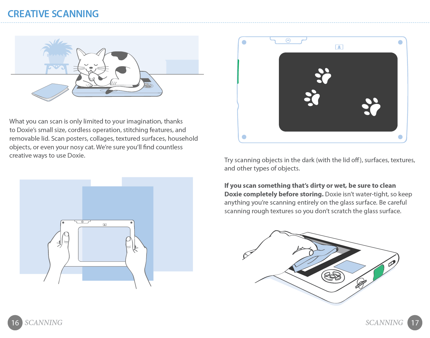
With most of the other Doxie scanners, the brand mascot was an anthropomorphized version of the scanner itself. With the flat Doxie Flip however, this wasn't possible, so we decided to use a cat as the brand mascot. This was because we wanted to convey that the Flip was fun and easy to use...so much so that you could scan anything, even your cat's paws.


TOOLS: Adobe Photoshop, Adobe Illustrator, Adobe InDesign
SKILLS: Art Direction, Graphic Design, Print Design & Layout, Illustration, Branding, Character Design, Technical Illustration, Help Materials Design